
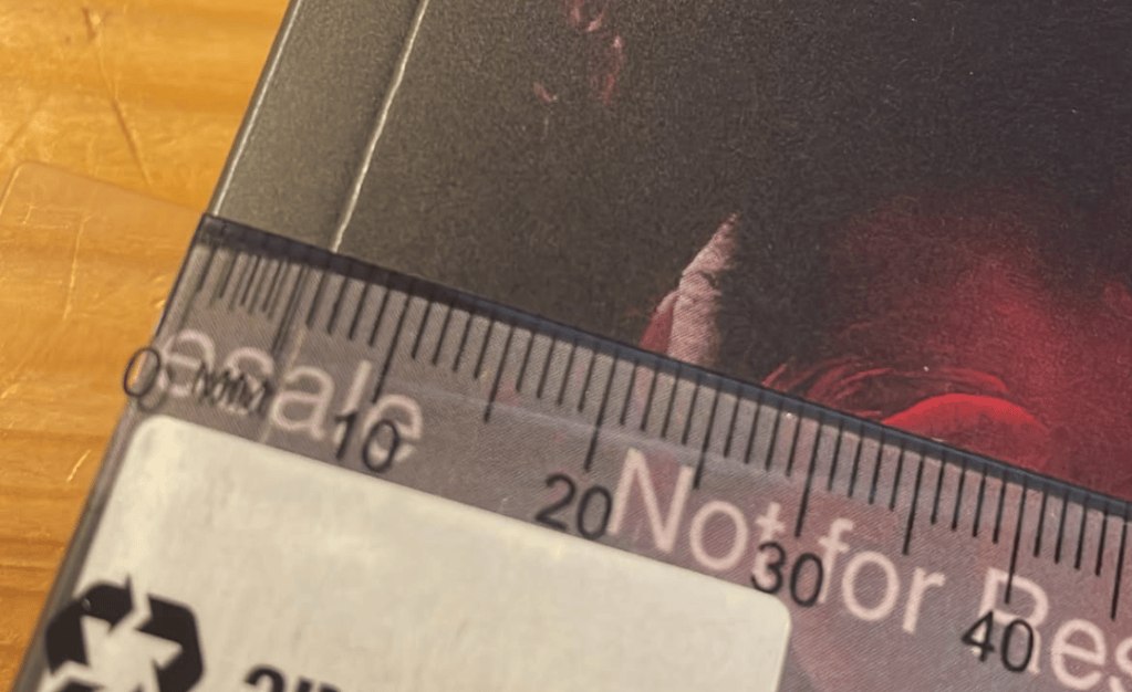
To Matte Or To Not Matte. Isn’t that the question? When it comes to finger smudges and dynamic colours, so much can differ between printers and materials. And after so long working with Ingram, going back to KDP I must admit threw me as I formatted for one only to re-discover KDP has their bleeds shifted just enough to throw things out and make me feel like a silly goose.
But we live and learn and this is why we do proof prints.
For those that follow me on social media, you probably saw Shaye and I’s reactions to the new print stock of Blood Veil a few weeks ago and how a change in printer was enough to make those colours pop.
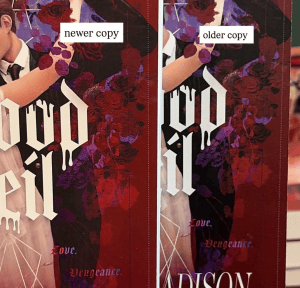
Oh how I wish indie authors had the same access to printers that trade do, what with their parent companies owning the printing houses so they can be looped in from the start for colour and bleed tests and calibrate as required. One day I’ll be able to provide that access!
Until then, we do what we can and adjust as required. And now it’s just done to that one question once more.
Matte or gloss?
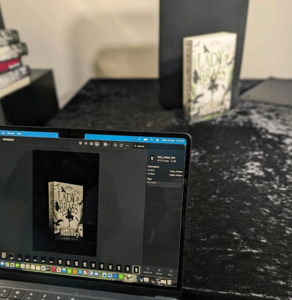
My poll on threads back in July had matte has the strong winner with 88% favouring, but I’ve since learned what is deemed matte actually shifts between printer and how they use create it. Whether it’s through the actual paper stock, or lamination.
Who will be the winner here? We’ll find out next week.
If you’re not following debuting author Krystal Lee already, find her here.




Leave a Reply